How we redesigned our website and successfully raised
$2 million in VC funding
SAGA Holobike
Website redesign project
Duration: August 1st - 14th
My responsibility: Product owner, UX designer
What
Saga is an SF-based startup.
Their product, HoloBike, augments mobility with holograms that are visible to the naked eye.
They are building an amazing futuristic product and are currently in need of funding.
Why
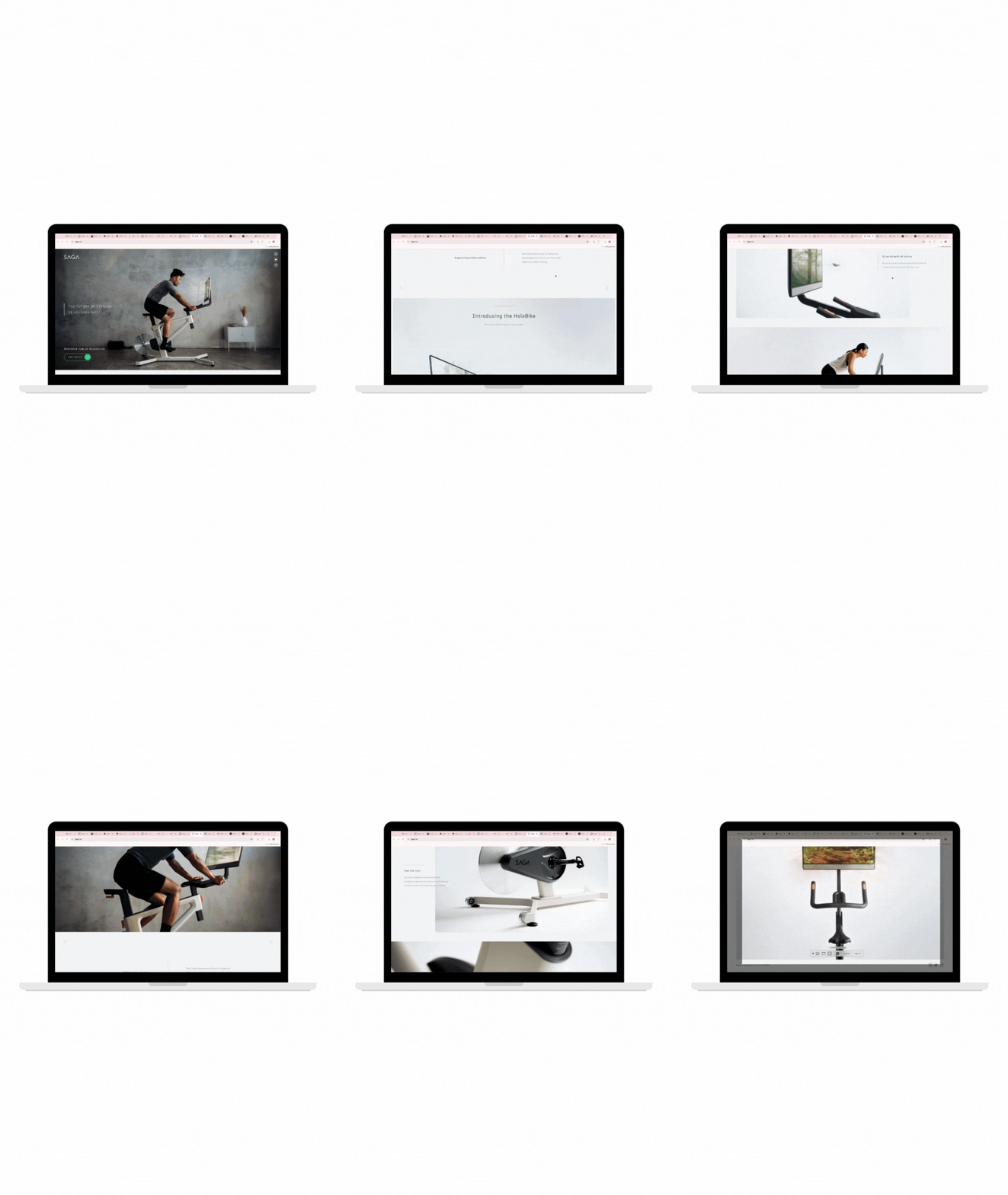
Their problem is that they have a website without enough information; in order to get funding from VCs they need to make a big impact.

Before


Problem
-
There is a lack of information. We need storytelling about how the Holobike helps our physical and physical health.
-
And how it is different from our competitors
-
We need to convince investors that the Holobike is more than just beautiful visuals. So we need to provide a “fun community” where people can discuss and give feedback not only on the product but also on the joy of owning a Holobike
-
We need to explain that our software allows users to check their daily exercise and get suggestions on how to improve their healthy lifestyle
-
There are no CTA buttons. This is an expensive hardware product. So our potential customers must want to see the demo video before clicking on pre-order.

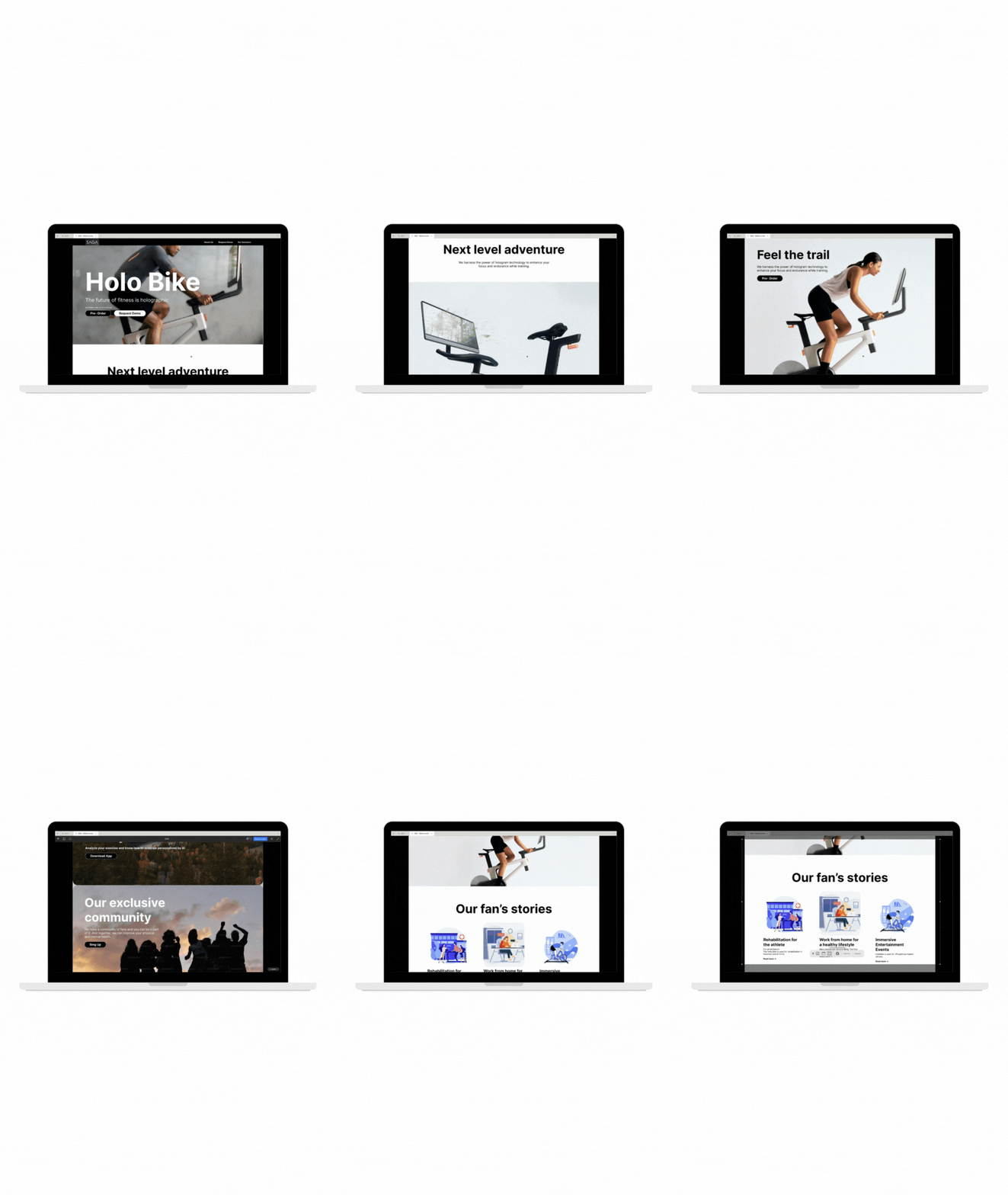
After

Big hero image, Big title
To make a big impact, we use excellent hero images and our titles are in large, high-contrast fonts for easy access.
CTA button
The (See Our demo) CTA button encourages prospective customers to view the demo. Since this is an expensive hardware product, they will want to see a demo before clicking “Pre-order.


The 3 key futures
Three key points express our features and strengths.
Show our fan's voices
Show that we have not only a product, but a product fan community, and that we have those delightful testimonials and exclusive fan events.


Show the data
Show data figures why our product is special and better than the competition.

The 3 steps to get the bike
Show how to get the product after pre-ordering in 3 steps. The current website doesn't have any information.
The key takeaway

As a startup founder, you need to get funding from investors, which is no easy task. So you need to make a big impact on investors with your elevator pitch.
So as a designer, I think you need to convince people through excellent storytelling on your website and pitch deck.
Here in the US, half of our potential clients are non-native English speakers or people who have trouble reading text.
So we need to use less text, be approachable, have a strong message and great visuals, and make it easy for a 5-year-old or a 100-year-old to understand.
