top of page


HEYWEAR Redesign
Project : HEYWEAR mobile store Redesign Role : UX research, UX Design, Prototyping, Usability testing, Visual Design Duration : 3. 2022 - 5 2022
Project Vision
This case study focused on HEYWEAR's mobile site, which was redesigned to make it more accessible.
Assumption
HYWEAR is an eyeglass company with three stores in New York City, but they found that their website and mobile site did not have good accessibility for their users. So we explored their pain points and gained insights for the redesign.
Persona
Jon (42)

Living in New York
Has a son
Need to buy new glasses
Love to research new startups
The margins are too small and the font is too peculiar to read.
I just want to see the products, but I can't see the product pages from the menu.
I wanted to see brand images in photos and GIFs, but the top page has too much text.
Buttons are hard to find and I would like to be more accessible.
I looked at Instagram and YouTube, but they don't seem to have good social media management (although I doubt this is the real official page since there is only one video on YouTube).
Lauren
(38)

Senior Technical Recruiter
Living in New York
Single
Need to buy new glasses
Fashion, foodie, social media lover
I like the lookbook because it is stylish, but since it is a unisex product, I would like to see two different photos, one for men and one for women.
I already need to buy new glasses so it is hard to read their text (font, less margins).
It was hard to find the product page (there is no product page in the menu).
Paper wireframe / Lo-Fi prototype

_HEIC.png)
Key Insight
1. Users want to know HEYWEAR's strong points quickly.
So we had better make a website which has a simple hero image which has strong points, originality.
2. Users want to see HEYWEAR's products quickly. It is difficult to find their products page from the presence website.
3. It is difficult to read a lot of text in the homepage to explain their service for users, so I need to use popular fonts, less text, use graphics, more spaces, good hero images, and good accessibility buttons.
Challenge 1.
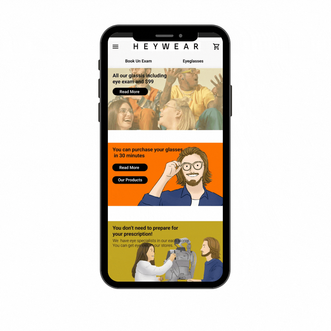
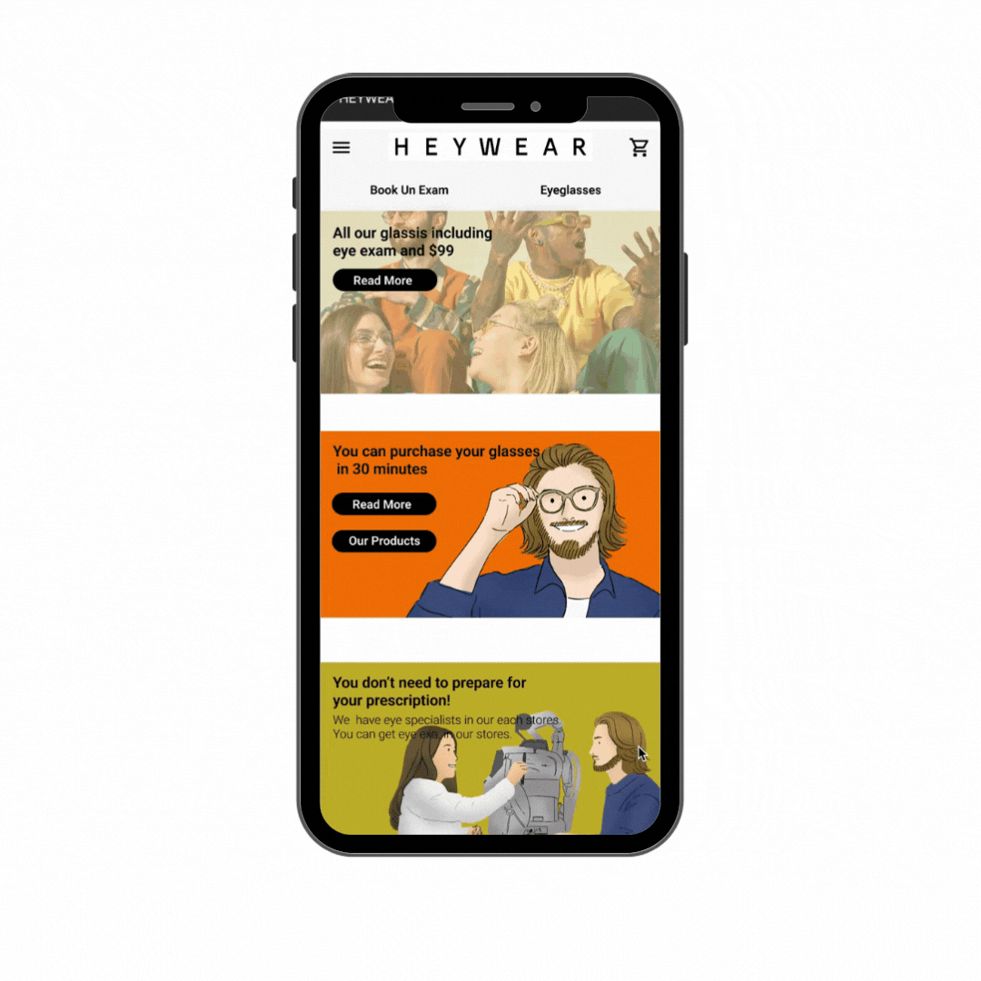
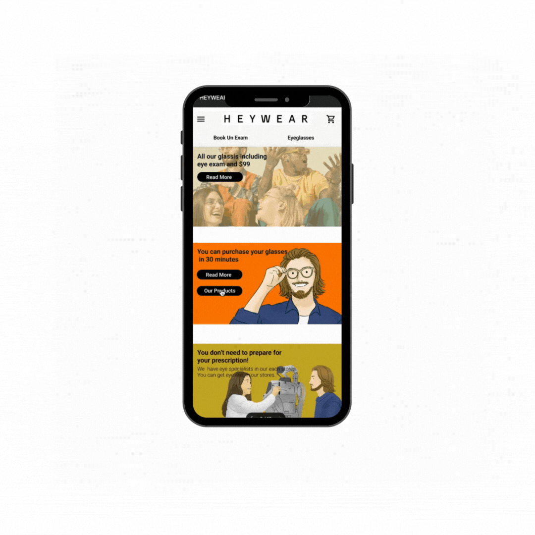
Using Roboto font, more spaces, less text on the homepage, and using more visuals. They have unisex products. I am so using female and male models.
Good accessibility buttons.
Challenge 2.
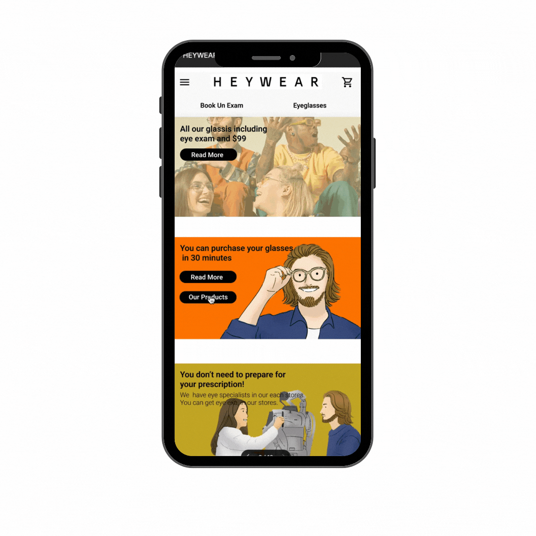
For the trustworthy, using their strong point to the home page."Including eye exam $99" "You can buy new glasses in 30 minutes." "Just walk in"
Challenge 3.
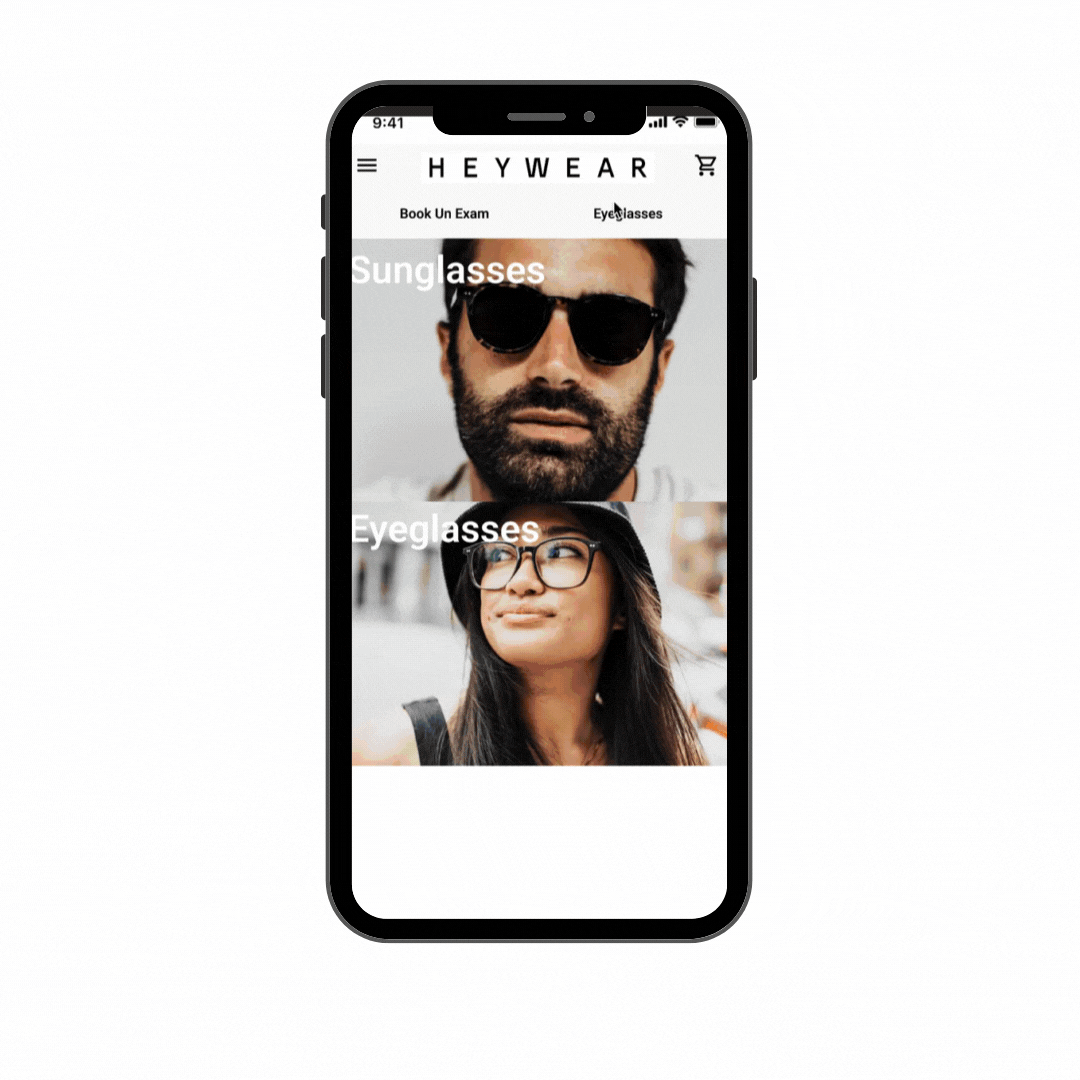
Make a product page and put it on the menu page because some users want to buy only sunglasses.
Before and After
.png)
.png)
.png)
.png)
.png)
Final Product
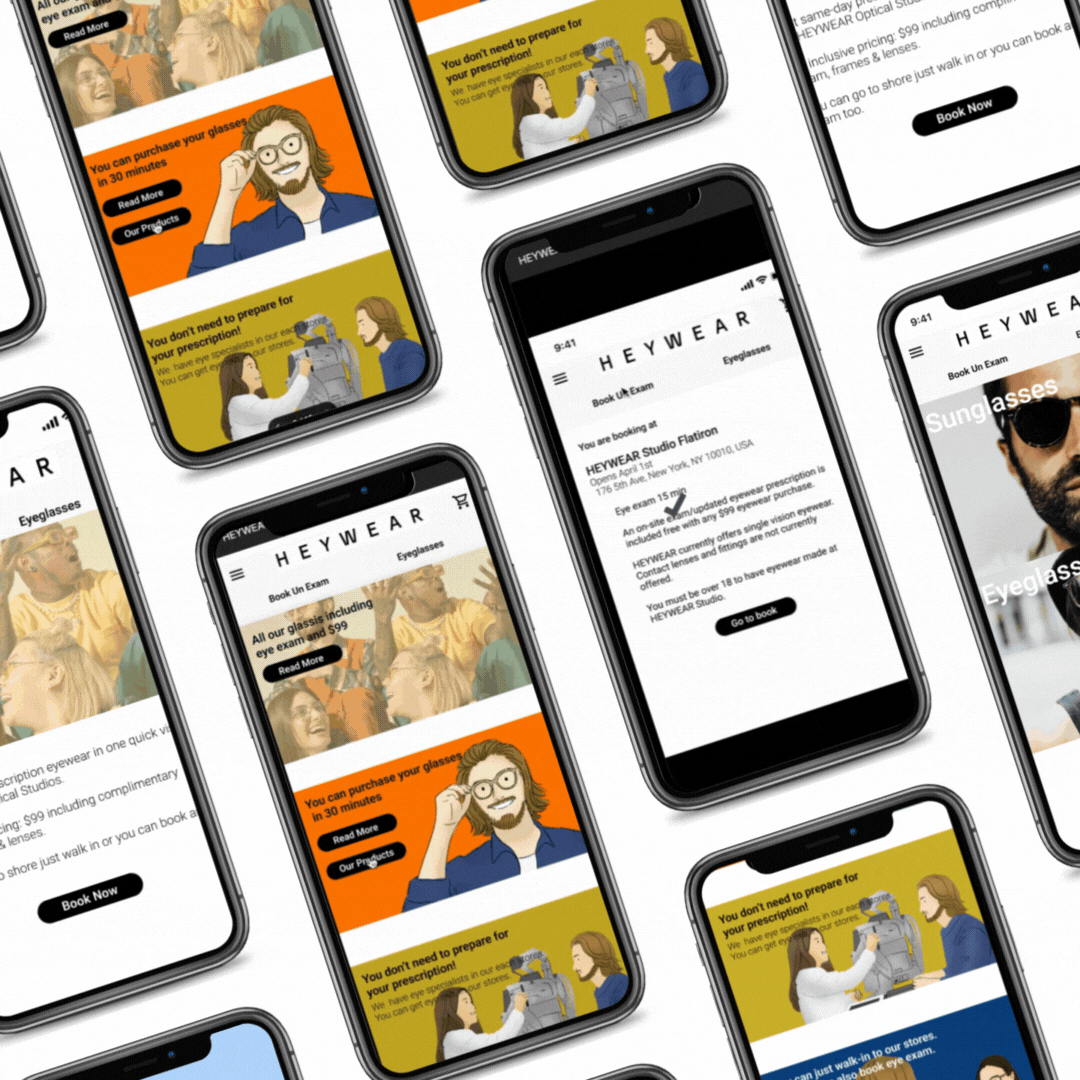

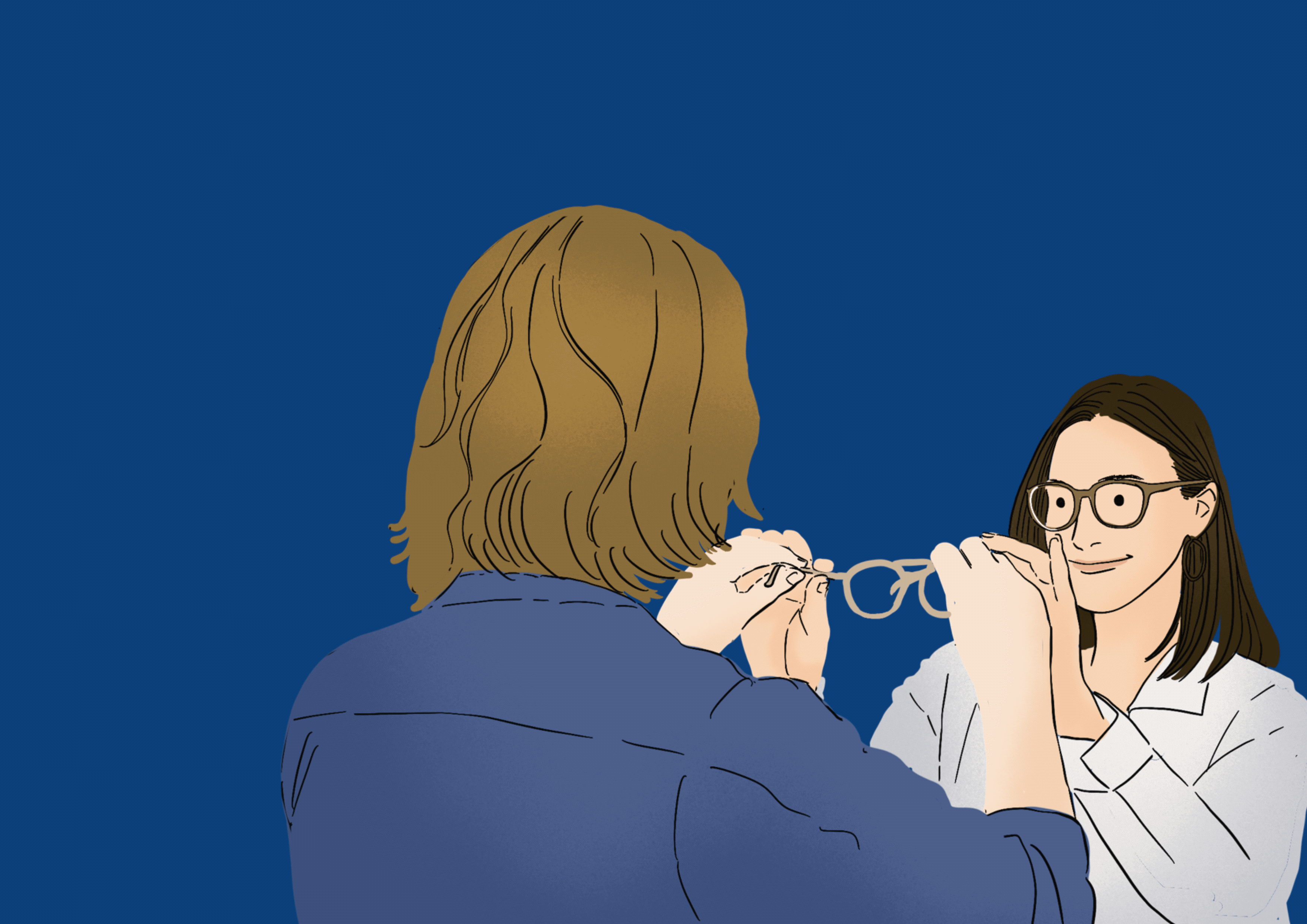
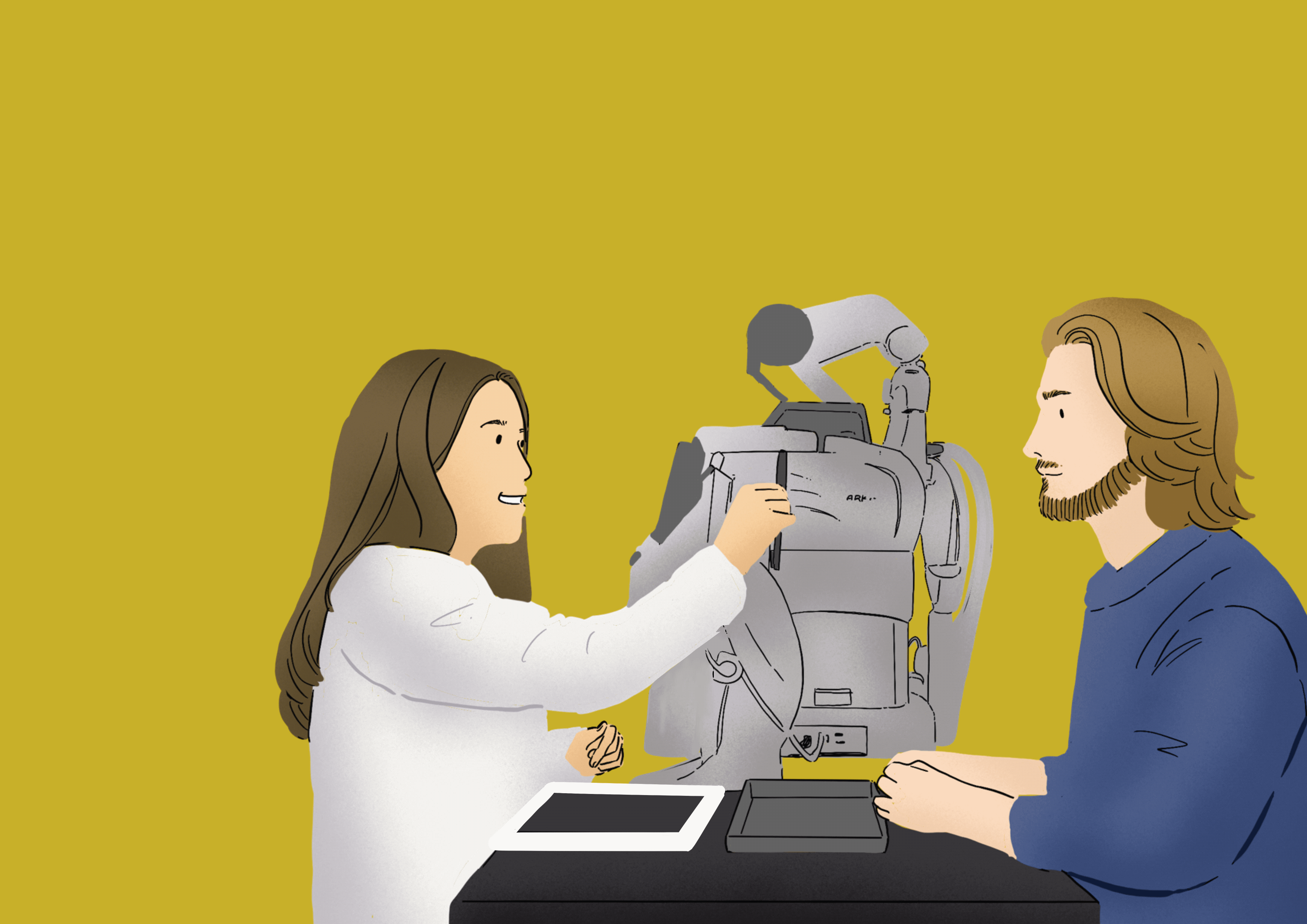
Illustration, GIFS
.png)
.png)
.png)
.png)
Takeaway
Maintaining users’ trust and confidence is crucial to achieving and maintaining user retention.
Throughout their journey around your website, visitors are continuously analyzing whether or not they believe what you’re saying, trust what you’re offering, and ultimately whether or not they want to stay or leave the site altogether.
While every individual begins their journey with various amounts of skepticism, a few crucial traits will either increase or decrease your trustworthiness.
So, while unique fonts and artistic visuals are acceptable for a fashion magazine, a mobile site for a company with an online store must first have a "trustworthy" feel.
Therefore, according to Material Design guidelines, clean images, appropriate fonts, and proper margins should be used.
bottom of page