Mastercard
SCM project
Project: SCM self-service Configuration Management System Role-UX designer, resercher Duration 2022-
*Due to company rules, I cannot disclose inside information, so all photos and mockups here are reproduced from notes I took.
Project vision
-
This case study focuses on designing the SCM (Self-service Configuration Management service) to more useful new screens for internal issuers to request new products
-
Improving User Experience of internal users requesting new products by re-designing the SCM (Self-service Configuration Management service)

Assumptions
-
Customers request products and begin configuration, but the current user flows were not user-friendly, complicated, and overwhelming users
-
Creating a simpler, user-friendly onboarding process, and screens for requesting products improves the customer experience for both new customers and existing customers
Our Design Thinking Process

Empathize:
research users' needs

Define:
state your users' needs and problems.

Ideate:
challenge assumptions and create ideas.

Test:
try your solutions out.

Prototype:
start to create solutions.
1. Emphasize - User interview
-
Research method: Online interviewing for 30-55 years old internal issue specialists (3 people)
-
Tools: Microsoft Teams, Figjam boards
-
Question areas
-
Around role, and how long have they worked in their role
-
Around their working process with current systems to request new products
-
What is the difference between MC BIN Account Range and Non-MC BIN Account Range
-
About their pain points for current systems
_JPG.jpg)
2. Define-Key insights
Inconsistent Terminology
There were a lot of terminologies and each system had slightly different names (inconsistency), so it was not easy for new customers.
Confusing Design and Flows
Previously it was a table design to check customers' BIN Account Ranges and request status which was not user-friendly.
Lack of Next Steps Info
After submitting the requests, the customer wants to know what is next? and how long they need to wait for the process.
3. Ideate


Affinity mapping
Competitor audit
Crazy eight
"How Might We" statements

User journey mapping
(current/proposal flows)
MoSCoW mapping
4. Prototype
-
Wireframing, lo-Fi mockups, and
-
Presentation to stakeholders to get feedback for our iteration.

Iteration on feedback
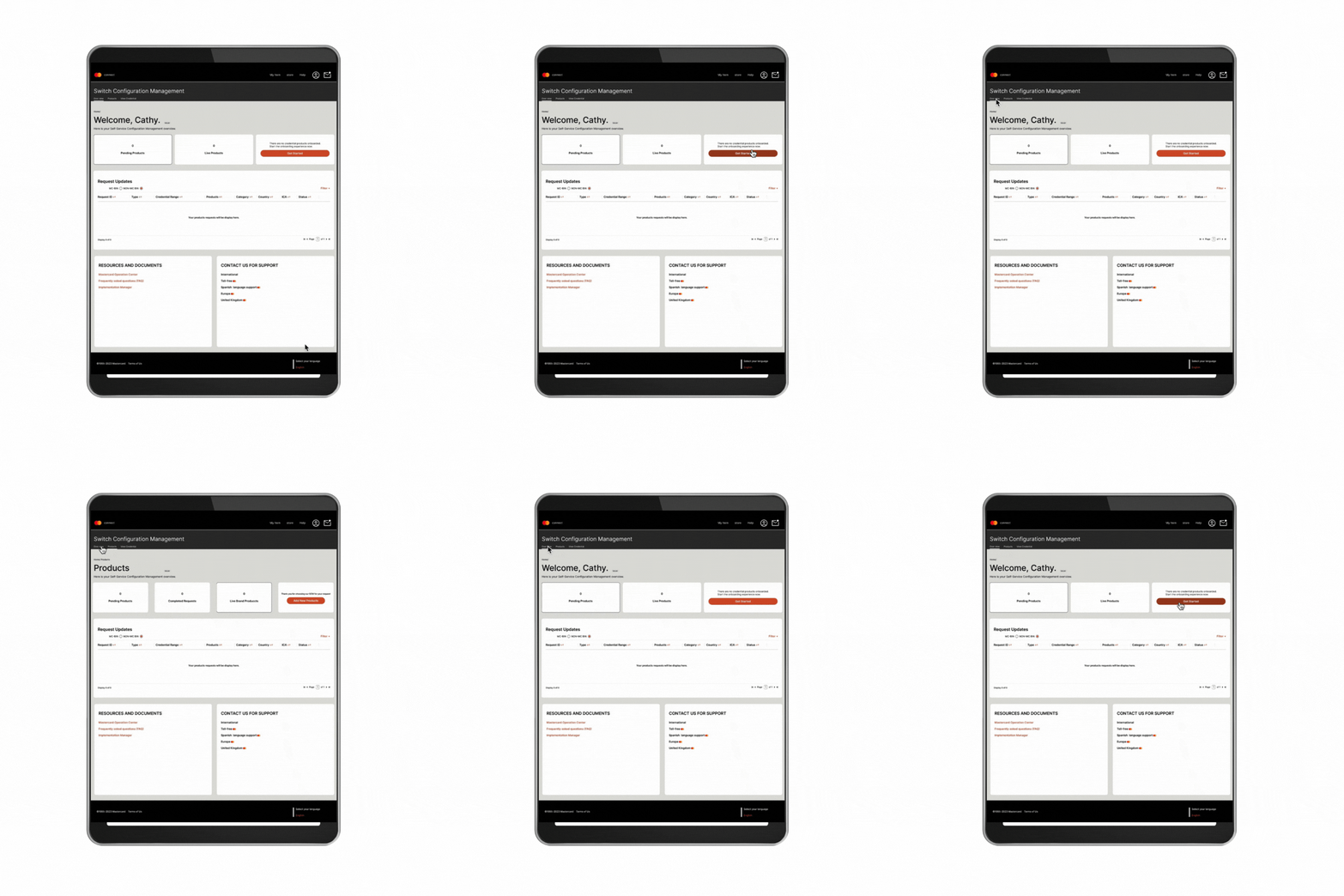
Create new screens using consistent terminology with small descriptions
Create simple navigation, and align tables to avoid overwhelming customer
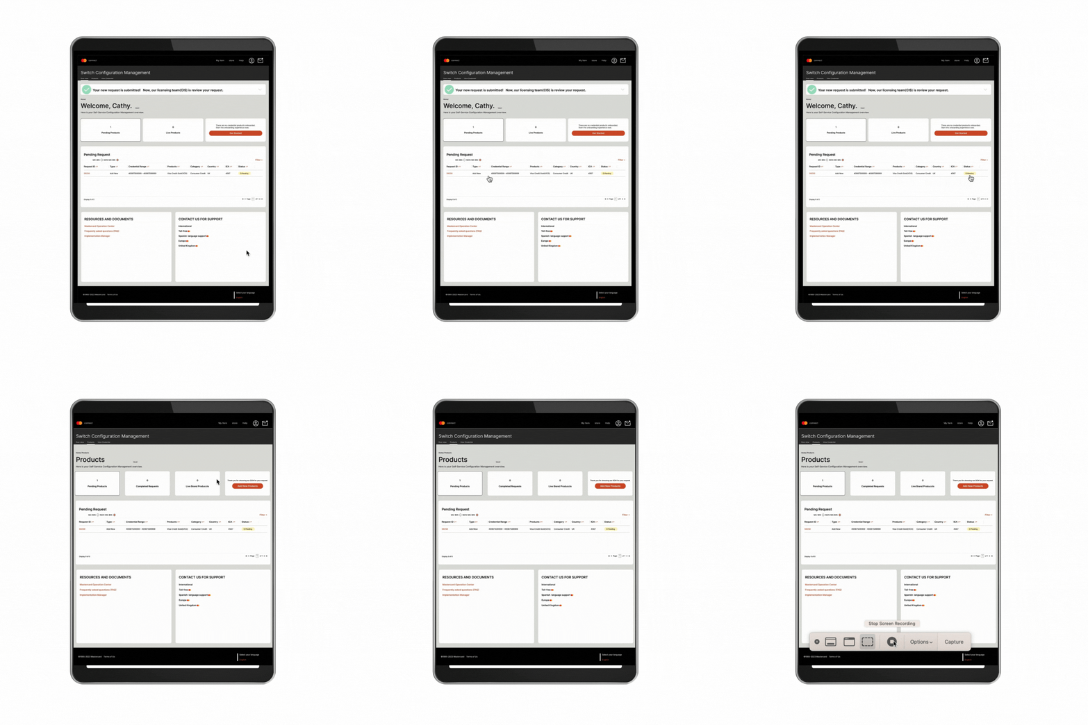
Create a new status column with multiple color icons with tooltips
Prototyping 2


5. Test - user testing
-
Moderate research for internal issuer specialists
-
Tools: Microsoft Teams, Figma

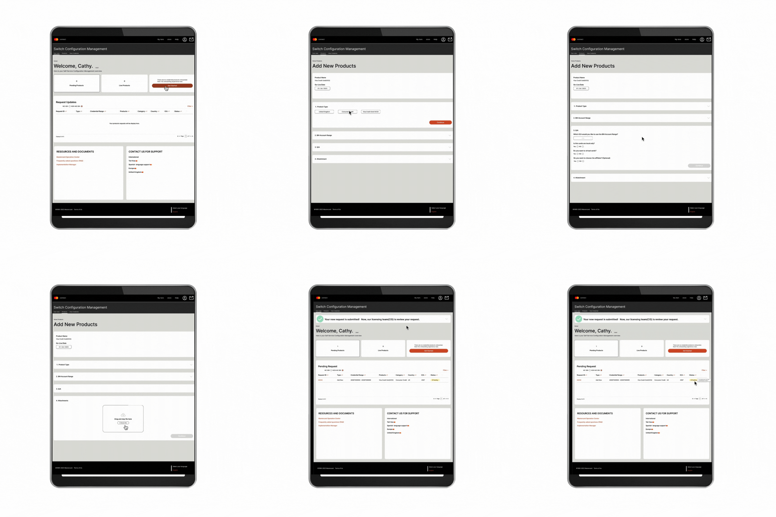
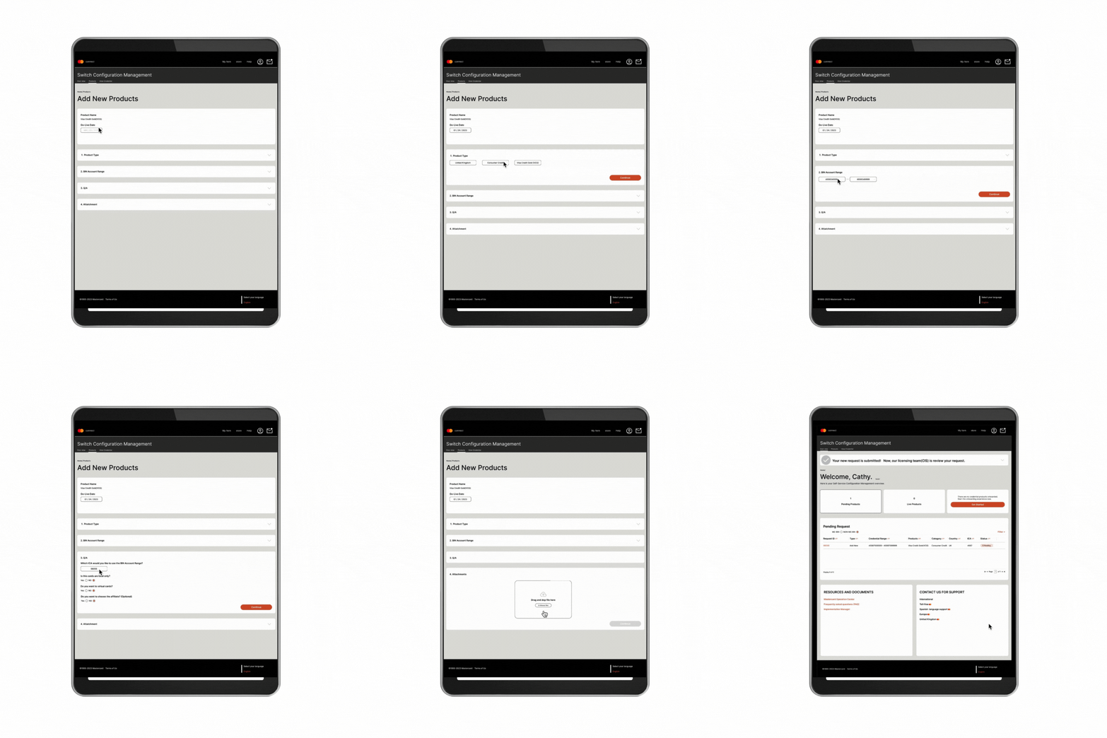
Iteration on Hi-Fi mockups
1
-
Simple navigation
-
Using consistent terminologies with small descriptions (user-friendly)
-
From the CTA button, and page tab, customers can request new products


-
Using the Mastercard design system (MADE) and creating new components, we created foldable columns for the Q&A page to organize, and avoid customers overwhelming (user-friendly)
2
3
-
Table with tooltips, and multiple color status so users can see their current status
-
Using tooltips for terminology and next-step information for customers (user-friendly)

What I learned

This project is a long-term project, and I worked on just one part of the massive system. Immersing myself in the project language and specific terms were essential for working with the broader team.
Listening to customers' real voices, and pain points, we could define the "must-haves" needed to design more user-friendly flows.
Financial technology is always improving. I believe that even experienced specialists need to keep learning to improve.
So, we can approach creating user-friendly design tools with tooltips, and small descriptions.
Good experience for good teamwork:
-
Design system and new components
-
Management of our long-term schedule to create our road map by Figjam board and make sure it is with stakeholders
-
Retrospective with other designers every month and clarification for our daily backlogs using the Figjam board

